Copywriter Q&A: Kathy Rinchiuso Keeps Website Projects On Track
July 9, 2020
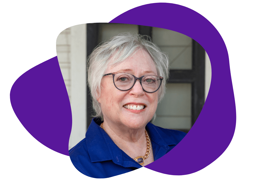
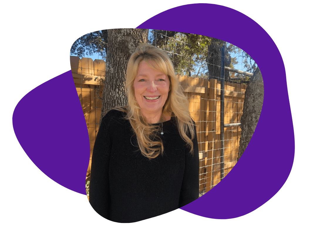
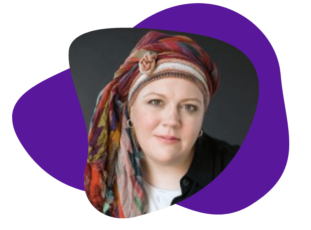
Whether you’re giving your existing website a much-needed update or starting from square after a company rebranding, chances are, you’ll work with Kathy Rinchiuso, our go-to website project manager. Kathy keeps the lines of communication open and ensures that clients, web designers, copywriters are all speaking the same language.
In this installment of Copywriter Q&A, Kathy talks about some of the unique challenges of website projects – and she also shares her awesomely simple explanation of web hosting.
TWFH: What role do you play in TWFH’s website services?
KR: There are a lot of moving parts in a website project, and I keep track of those moving parts. I coordinate with subject matter experts and make sure the writers have the information they need. And a huge part of my job is to work with the client and find out what they don’t like and what they like in a website and convey that to the designers.
Creating a website can be overwhelming, and it’s my job to take clients step-by-step and make the process as non-overwhelming and un-stressful as possible.
TWFH: So, what’s the first step in creating a new website?
KR: First we talk about what they do. We ask about their customers and their competitors, and we learn what makes them stand out in their industry. We also discuss design preferences. If the client has an existing website, we try to find out what they do and don’t like about the design and the copy.
That’s one thing that can be confusing to clients: We feel it’s important to do the design and write the copy at the same time. They’re like, “Why can’t we just write the copy and worry about the design later?”
TWFH: Why doesn’t that approach work?
KR: Because where you put the copy and how it works with graphics and navigation is really, really important. If you do the design and the copy separately, you’ll end up with a website that looks slapped together.
TWFH: Are there any other common challenges when starting a website project?
KR: Internal design conflicts are common if you’ve got multiple people providing input: Adam loves yellow and blue, but Joe hates yellow and blue. Or – and this is especially true with websites – they just don’t know what they want. They just say, “I don’t know, surprise me.”
TWFH: How do you get a feel for what a website client is looking for?
KR: I’ve found that it can help to use design questionnaires. For example, we’ll send the stakeholders links to three very different websites that we feel are examples of good design, and we ask everyone to tell us three things they like and three things they dislike about each one. That helps get them focused and thinking about design elements.
TWFH: And what about avoiding “design wars”? How can you ensure that you’re taking everyone’s preferences into account?
KR: We’ve found that anonymous surveys work best. Phone calls don’t give people enough time to really think things through. And if we’re talking to multiple people with conflicting opinions, it can be hard for everyone to be honest about their likes and dislikes; everyone is trying to be polite. But when we send out an anonymous survey, people are a lot more honest. You can see what people are really thinking, and if there are conflicting answers, you can deal with that.
It’s also helpful for the design team: I can send specific, useful direction instead of nebulous comments like, “The client likes this website but they don’t know why.”
TWFH: Are there any other common points of confusion about website projects? What questions do new website clients ask most often?
KR: I get a lot of questions about domain names and hosting. It’s confusing. Unless you’re living and breathing web design, you might not know the difference.
TWFH: You’ve come up with a pretty great explanation for this. Can you share it?
KR: Your domain name is your website’s address: It usually ends in “.com” (I always recommend using “.com” – it sounds more trustworthy than “.net”). You have to have an address for your website to be searchable. It’s just like you have to have an address at your house so people can find you.
And paying for hosting is like paying rent or mortgage. Your domain name is your address, but you have to pay rent to make sure that your website can “live” at that address.
TWFH: Are there any parts of the website process that might be surprising to a new client? What are some things that I should know if I’m starting a website project?
KR: We use WordPress for most of our website projects. That can be surprising to some clients. But WordPress is updated all the time, there are templates galore, and there are a million plugins you can use to have your site do what you want to do.
Plus, it’s very user-friendly: After your website is up, it’s very easy to update it in WordPress. And that means you don’t have to call the web developers every time you need to make a small change.
TWFH: Ten years ago, nobody used WordPress for websites. It was just a “free blogging site.”
KR: Some people still think of it that way. But almost everybody uses it these days!
TWFH: You’ve worked on a ton of websites. Do you have a list of “must-haves” for new website clients?
KR: It’s important to have a useful, informative About Us page. People don’t want to read a bunch of buzzwords; they want to read about your actual company and the people. A good website should also include easy-to-find contact information, like a phone number and email or at least a “contact” button that you can click on. If your contact information is not easily accessible you lose customers. It’s also helpful to have a good “What you do” page; a basic overview that of what you do and why you’re better than everyone else. This should be about a paragraph long – nobody needs to read 18 pages to figure out what you do.
TWFH: What about things to avoid? What are some things to avoid when creating a new website?
KR: Anything that makes your website feel dated: If your home page has got a ridiculous amount of text on it, or if it blasts music at you, it can feel very dated. Or if you don’t have social media information and links to Facebook and things like that. The color scheme and the font can make a website look dated, too. Honestly, though, the home page makes the biggest difference: It needs to be concise and modern and sleek.
TWFH: And that’s where good design comes in.
KR: If you’re paying for a writer to write professional copy, you should pay for a professional designer.
